In this article, I’d like to show you how you can easily create and edit your own block theme.
Creating the Theme
The “Create Block Theme” Plugin
With the “Create Block Theme” plugin, you can basically create your own theme at the push of a button. Alternatively, you can also create a child theme of an existing theme.
After installing the plugin, the first thing you do is open the Site Editor. You can find it in the admin menu under Appearance. However, you need to have a block theme activated for this. For this example, I’m using WordPress’s own Twenty Twenty-Four theme.
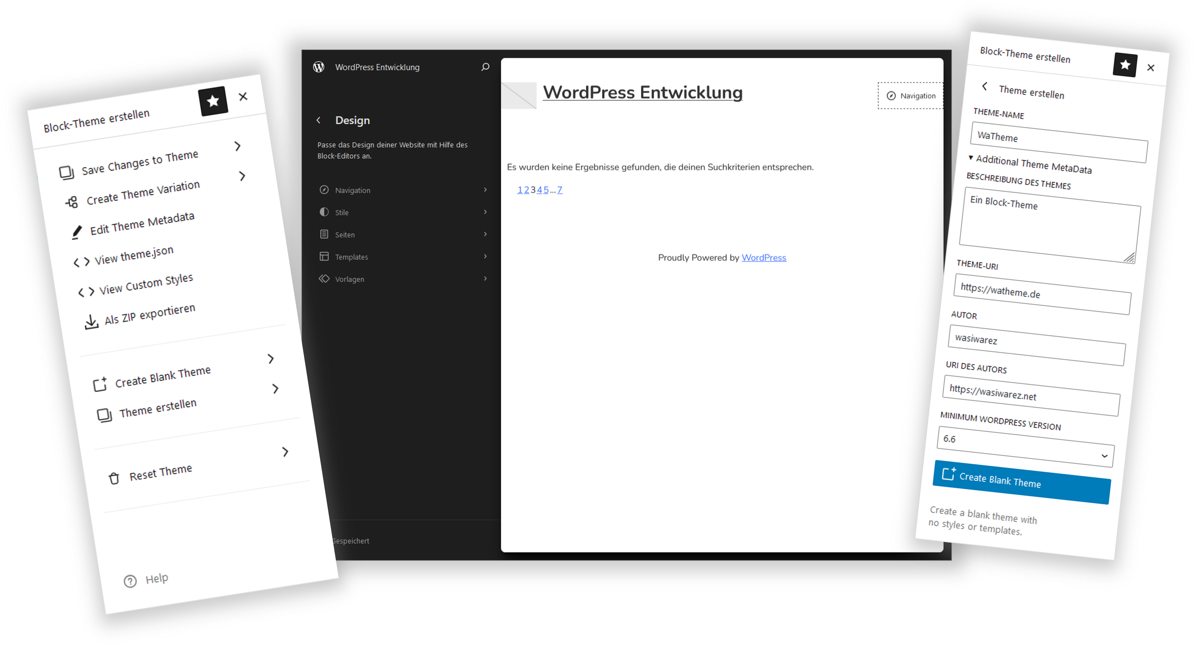
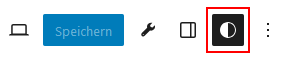
Once you’re in the Site Editor, click anywhere on the page. A sidebar will open on the right. There, you’ll find a tab marked with a wrench icon.

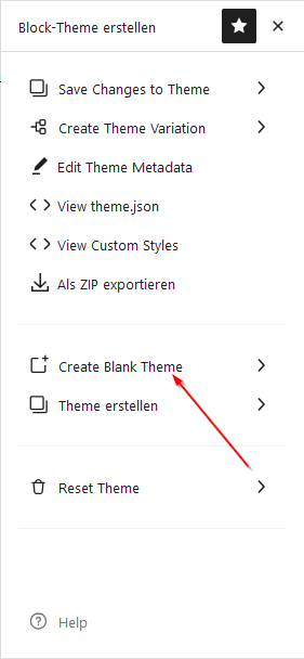
When you click the wrench, the “Create Block Theme” plugin menu opens.
There, you’ll find the option “Create Blank Theme.” This lets you create a completely blank block theme.
Under “Create Theme,” you can alternatively clone the current theme or create a child theme.
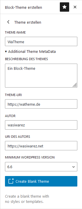
Now fill in the fields.
You must enter the theme name.
By clicking on Additional Theme MetaData, you can open the section where you can enter more metadata. A description is always helpful if you already know how the theme should look and what features it will have.
You can enter a Theme URI if you plan to create a website for the theme later.
Author and Author URI also make sense, if available.
I would always set the Minimum WordPress Version to the current version, since you’re developing the theme with this version.
You can also enter or change these details later in the style.css and readme.txt.
Now click Create Blank Theme, and the theme will be created and activated.
The theme.json File
In block themes, the theme.json file contains all the information about how blocks should look when you add them. It includes global settings as well as the finest details for individual blocks. Here, you can style the theme and all blocks however you like.
If you now look at the automatically generated theme.json file in the theme folder, it looks like this.
{
	"$schema": "https://schemas.wp.org/wp/6.6/theme.json",
	"settings": {
		"appearanceTools": true,
		"layout": {
			"contentSize": "620px",
			"wideSize": "1000px"
		},
		"spacing": {
			"units": [ "%", "px", "em", "rem", "vh", "vw" ]
		},
		"typography": {
			"fontFamilies": [
				{
					"fontFamily": "-apple-system, BlinkMacSystemFont, 'Segoe UI', Roboto, Oxygen-Sans, Ubuntu, Cantarell, 'Helvetica Neue', sans-serif",
					"name": "System Font",
					"slug": "system-font"
				}
			]
		},
		"useRootPaddingAwareAlignments": true
	},
	"templateParts": [
		{
			"area": "header",
			"name": "header"
		},
		{
			"area": "footer",
			"name": "footer"
		}
	],
	"version": 3
}
As you can see, it’s not very large yet. We’ll make sure that changes later on, all without manually editing the file.
The Fonts
In this state, our new theme doesn’t have any fonts yet. I like to work with local fonts, as this reduces page load traffic and is GDPR-friendly.
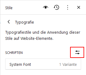
You can find the “Fonts” section in the “Styles” tab under Typography.
If you then click the “Manage Fonts” button, a window will open where you can install, activate, and delete fonts.
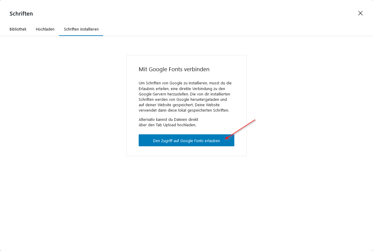
Here, go to the “Install Fonts” tab and grant access to Google Fonts. Then you can install the fonts you want.
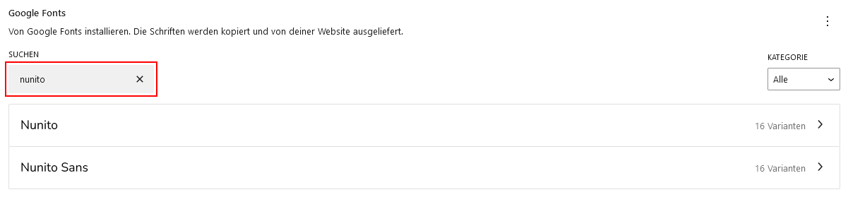
Simply enter the font you want to install into the search field. I’ll do this here with Nunito and later with Comfortaa and Quicksand.
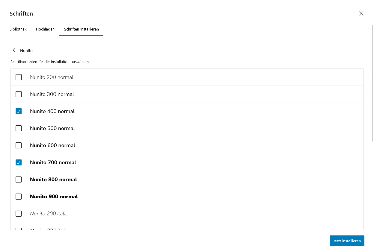
For the selected font, choose the variants you want to use later. You can also select all of them, but too many fonts can affect the theme’s performance. Therefore, unused fonts should be deactivated later.
Once you’ve finished selecting, confirm by clicking Install Now.
Save Changes in theme.json
One of the biggest advantages of block themes, in my opinion, is that changes made in the front end can be easily written into the theme.json file.
For this, we need to open the “Create Block Theme” menu again.
By clicking on “Save Changes to Theme,” you enter a submenu.
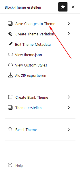
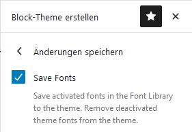
Here, select Save Fonts. You can leave the other checkboxes unchecked for now. Then, click Save Changes at the bottom.
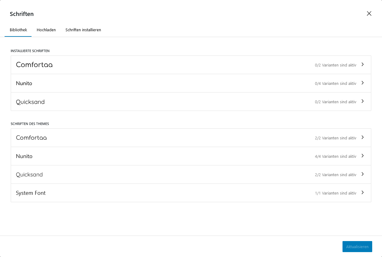
After reloading the page, you can see in the Fonts Library that the installed fonts are now listed under “Theme Fonts.” As mentioned earlier, I’ve also installed Nunito, Comfortaa, and Quicksand.
You’ll also notice that under “Installed Fonts,” all variants are set to “inactive.” You can now select and delete any fonts there.
The Fonts in theme.json
If you now take another look at the theme.json file in your theme directory, you’ll see that all the fonts are now listed there. Under settings, there is now a typography structure.
...
        "typography": {
            "fontFamilies": [
                {
                    "fontFamily": "-apple-system, BlinkMacSystemFont, 'Segoe UI', Roboto, Oxygen-Sans, Ubuntu, Cantarell, 'Helvetica Neue', sans-serif",
                    "name": "System Font",
                    "slug": "system-font"
                },
                {
                    "name": "Nunito",
                    "slug": "nunito",
                    "fontFamily": "Nunito, sans-serif",
                    "fontFace": [
                        {
                            "src": [
                                "file:./assets/fonts/nunito/nunito-400-normal.woff2"
                            ],
                            "fontWeight": "400",
                            "fontStyle": "normal",
                            "fontFamily": "Nunito"
                        },
                        {
                            "src": [
                                "file:./assets/fonts/nunito/nunito-400-italic.woff2"
                            ],
                            "fontWeight": "400",
                            "fontStyle": "italic",
                            "fontFamily": "Nunito"
                        },
                        {
                            "src": [
                                "file:./assets/fonts/nunito/nunito-700-normal.woff2"
                            ],
                            "fontWeight": "700",
                            "fontStyle": "normal",
                            "fontFamily": "Nunito"
                        },
                        {
                            "src": [
                                "file:./assets/fonts/nunito/nunito-700-italic.woff2"
                            ],
                            "fontWeight": "700",
                            "fontStyle": "italic",
                            "fontFamily": "Nunito"
                        }
                    ]
                },
                {
                    "name": "Quicksand",
                    "slug": "quicksand",
                    "fontFamily": "Quicksand, sans-serif",
                    "fontFace": [
                        {
                            "src": [
                                "file:./assets/fonts/quicksand/quicksand-400-normal.woff2"
                            ],
                            "fontWeight": "400",
                            "fontStyle": "normal",
                            "fontFamily": "Quicksand"
                        },
                        {
                            "src": [
                                "file:./assets/fonts/quicksand/quicksand-700-normal.woff2"
                            ],
                            "fontWeight": "700",
                            "fontStyle": "normal",
                            "fontFamily": "Quicksand"
                        }
                    ]
                },
                {
                    "name": "Comfortaa",
                    "slug": "comfortaa",
                    "fontFamily": "Comfortaa, system-ui",
                    "fontFace": [
                        {
                            "src": [
                                "file:./assets/fonts/comfortaa/comfortaa-400-normal.woff2"
                            ],
                            "fontWeight": "400",
                            "fontStyle": "normal",
                            "fontFamily": "Comfortaa"
                        },
                        {
                            "src": [
                                "file:./assets/fonts/comfortaa/comfortaa-700-normal.woff2"
                            ],
                            "fontWeight": "700",
                            "fontStyle": "normal",
                            "fontFamily": "Comfortaa"
                        }
                    ]
                }
            ]
        },
...
Additionally, you’ll notice that under settings.typography.fontFamilies.fontFace.src, the path always points to the ./assets/fonts/... folder. This folder was automatically created by the “Create Block Theme” plugin, so the fonts are installed locally by default.
Assigning Fonts to Elements
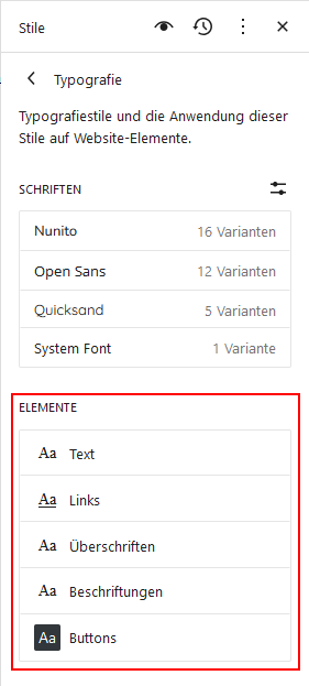
Next, you need to assign the new fonts to the elements. You do this in the Styles tab under Typography. At the bottom, you’ll find the Elements section.
If you click on an element, for example Text, you can set the font for all standard text.
Under Links, set the font for links; under Headings, set the font for headings, and so on.
Here are the settings I’m using:
| Element | Font |
|---|---|
| Text | Nunito |
| Links | Nunito |
| Headings | Quicksand |
| Labels | Nunito |
| Buttons | Comfortaa |
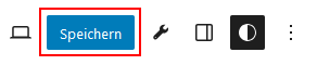
Now you need to save the changes for the first time using the regular Save button.
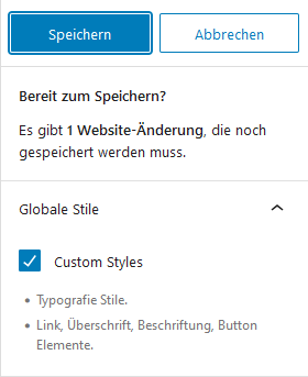
Here, you’ll see a list of everything you’re about to save. You’ve now changed the fonts for the elements, so this will be displayed correctly here.
So, click Save.
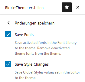
Then save the changes back to the theme, as described above. This time, you also need to enable the Save Style Changes option.
If you now look at the theme.json file, you’ll notice an additional styles structure, where the fonts are assigned to the individual elements. This is now the default setting for the theme.
...
	"styles": {
		"elements": {
			"button": {
				"typography": {
					"fontFamily": "var(--wp--preset--font-family--comfortaa)"
				}
			},
			"caption": {
				"typography": {
					"fontFamily": "var(--wp--preset--font-family--nunito)"
				}
			},
			"heading": {
				"typography": {
					"fontFamily": "var(--wp--preset--font-family--quicksand)"
				}
			},
			"link": {
				"typography": {
					"fontFamily": "var(--wp--preset--font-family--nunito)"
				}
			}
		},
		"typography": {
			"fontFamily": "var(--wp--preset--font-family--nunito)"
		}
	},
...
The Color Palette
Setting up the color palette is quite simple after adding the fonts.
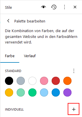
You can also find the color palette in the Styles tab by clicking Colors and then Palette.
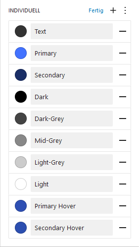
If you click the “+” next to Custom at the bottom, you can add and name a color.
For my theme, I chose two shades of blue as the primary and secondary colors. I also defined a custom text color and several shades of gray.
Here’s the list:
| Label | Hex-Code |
|---|---|
| Text | #333333 |
| Primary | #4272ff |
| Secondary | #1a2e66 |
| Dark | #000000 |
| Dark-Grey | #444444 |
| Mid-Grey | #888888 |
| Light-Grey | #cccccc |
| Light | #ffffff |
| Primary Hover | #2e4fb3 |
| Secondary Hover | #2c4fb0 |
One note: naming the colors Dark and Light as Black and White would, of course, make more sense. However, this currently causes an issue — the colors won’t appear in the palette.
To apply the changes, simply save and then write the updates to the theme.
The Color Palette in theme.json
You now have a new color structure under settings. There you can see the entire palette you created. Under name, you’ll find the label you entered for each color. The slug was generated automatically by WordPress.
As a small aesthetic adjustment, I remove the “custom-” prefix from each slug. That’s another advantage of block themes—you can make changes directly in the theme.json file without breaking everything.
These changes are then stored as the default for the theme. If you later click Reset on any option, the state from the theme.json will be restored.
...
		"color": {
			"palette": [
				{
					"color": "#333333",
					"name": "Text",
					"slug": "custom-text"
				},
				{
					"color": "#4272ff",
					"name": "Primary",
					"slug": "custom-primary"
				},
				{
					"color": "#1a2e66",
					"name": "Secondary",
					"slug": "custom-secondary"
				},
				{
					"color": "#000000",
					"name": "Dark",
					"slug": "custom-dark"
				},
				{
					"color": "#444444",
					"name": "Dark-Grey",
					"slug": "custom-dark-grey"
				},
				{
					"color": "#888888",
					"name": "Mid-Grey",
					"slug": "custom-mid-grey"
				},
				{
					"color": "#cccccc",
					"name": "Light-Grey",
					"slug": "custom-light-grey"
				},
				{
					"color": "#ffffff",
					"name": "Light",
					"slug": "custom-light"
				},
				{
					"color": "#2e4fb3",
					"name": "Primary Hover",
					"slug": "custom-primary-hover"
				},
				{
					"color": "#2c4fb0",
					"name": "Secondary Hover",
					"slug": "custom-secondary-hover"
				}
			]
		},
...
The Color Slugs as CSS Variables
The slugs can later be used as CSS variables. The variables have the following format:
var(--wp--preset--color--SLUG)
Replace SLUG with, for example, primary to assign the primary color to an element.
This is also how colors are assigned in the theme.json file. You could use fixed hex codes, but then the theme wouldn’t update dynamically if someone edits the color palette. By using the variables, editing the palette can instantly create a completely new design.
Assigning Colors to Elements
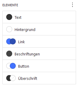
Next, you can assign colors to individual elements, such as text, background, links, and so on.
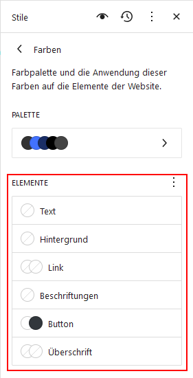
To do this, go to the Styles tab again, click Colors, and you’ll see the elements listed at the bottom. Click each one individually and select the theme colors you want to assign. You need to reload the page once first so the colors are properly assigned to the theme after being written into the theme.json.
This is how it should look after reloading the page, when you want to set the color for, for example, text. For the text color, I, of course, choose the color labeled Text. When you hover over the color with your mouse, the color’s label will be displayed.
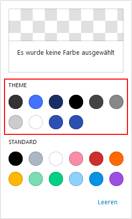
In the end, it should look like this.
Here are the assignments I made:
| Element | Color 1 | Color 2 |
|---|---|---|
| Text | Text | |
| Background | Light | |
| Link | Primary (Standard) | Primary Hover (On Hover) |
| Labels | Dark-Grey | |
| Button | Light (Text) | Primary (Background) |
| Heading | Text | (None) |
To apply the changes, simply save and then write the updates to the theme.
The Elements and Their Colors in theme.json
Now you can see that the elements not only have fonts assigned but also color settings. Additionally, under styles, there is now a color structure. Here you’ll find the default settings for text and background.
...
		"color": {
			"background": "var(--wp--preset--color--light)",
			"text": "var(--wp--preset--color--text)"
		},
		"elements": {
			"button": {
				"color": {
					"background": "var(--wp--preset--color--primary)",
					"text": "var(--wp--preset--color--light)"
				},
				"typography": {
					"fontFamily": "var(--wp--preset--font-family--comfortaa)"
				}
			},
			"caption": {
				"color": {
					"text": "var(--wp--preset--color--dark-grey)"
				},
				"typography": {
					"fontFamily": "var(--wp--preset--font-family--nunito)"
				}
			},
			"heading": {
				"color": {
					"text": "var(--wp--preset--color--text)"
				},
				"typography": {
					"fontFamily": "var(--wp--preset--font-family--quicksand)"
				}
			},
			"link": {
				":hover": {
					"color": {
						"text": "var(--wp--preset--color--primary-hover)"
					}
				},
				"color": {
					"text": "var(--wp--preset--color--primary)"
				},
				"typography": {
					"fontFamily": "var(--wp--preset--font-family--nunito)"
				}
			}
		},
...
Under link, you’ll even find a :hover structure. This sets the color a link should have when you hover over it with the mouse. You can later use this to give buttons a different color on hover as well. Unfortunately, this isn’t possible in any other way at the moment.
Styling Buttons on Hover
I just want to briefly explain how you can style the pseudo-classes of buttons. For this, you unfortunately need to edit the theme.json file.
You need to add a :hover structure to styles.elements.button. Alternatively, you can use :focus or :active if you want to style those pseudo-classes. It should look like this:
...
		"elements": {
			"button": {
				"color": {
					"background": "var(--wp--preset--color--primary)",
					"text": "var(--wp--preset--color--light)"
				},
				"typography": {
					"fontFamily": "var(--wp--preset--font-family--comfortaa)"
				},
				":hover": {
					"color": {
						"text": "var(--wp--preset--color--primary)",
						"background": "var(--wp--preset--color--light)"
					}
				}
			},
			...
		},
...
Shadows
Just like you configured the colors, you can also configure shadows and save them to the theme. I won’t go into the details here, though.
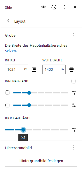
The Layout
One thing you should definitely configure is the layout.
You can find the layout settings again in the Styles tab under Layout.
I want a rather wide layout. I set the content width to 1024px and the wide width to 1400px.
I set the inner and block spacing to XS.
You can also click the small slider icons on the right. This allows you to set spacing with a specific unit, such as px or rem.
To apply the changes, simply save and then write the updates to the theme.
The Layout Settings in theme.json
Under settings, you can see that the layout structure has changed. Under styles, a spacing structure has been created, containing the blockGap and padding settings we just configured.
{
	"settings": {
		...
		"layout": {
			"contentSize": "1024px",
			"wideSize": "1400px"
		},
		...
	},
	"styles": {
		...
		"spacing": {
			"blockGap": "var(--wp--preset--spacing--30)",
			"padding": {
				"bottom": "var(--wp--preset--spacing--30)",
				"left": "var(--wp--preset--spacing--30)",
				"right": "var(--wp--preset--spacing--30)",
				"top": "var(--wp--preset--spacing--30)"
			}
		},
		...
	},
...
Your First Block Theme
You’ve now created your first block theme—and all of this without writing a single line of code.
In the next article, we’ll focus on creating templates. After all, we want different post types to be displayed differently.
Leave a Reply
You must be logged in to post a comment.