


Category: Webdesign
-
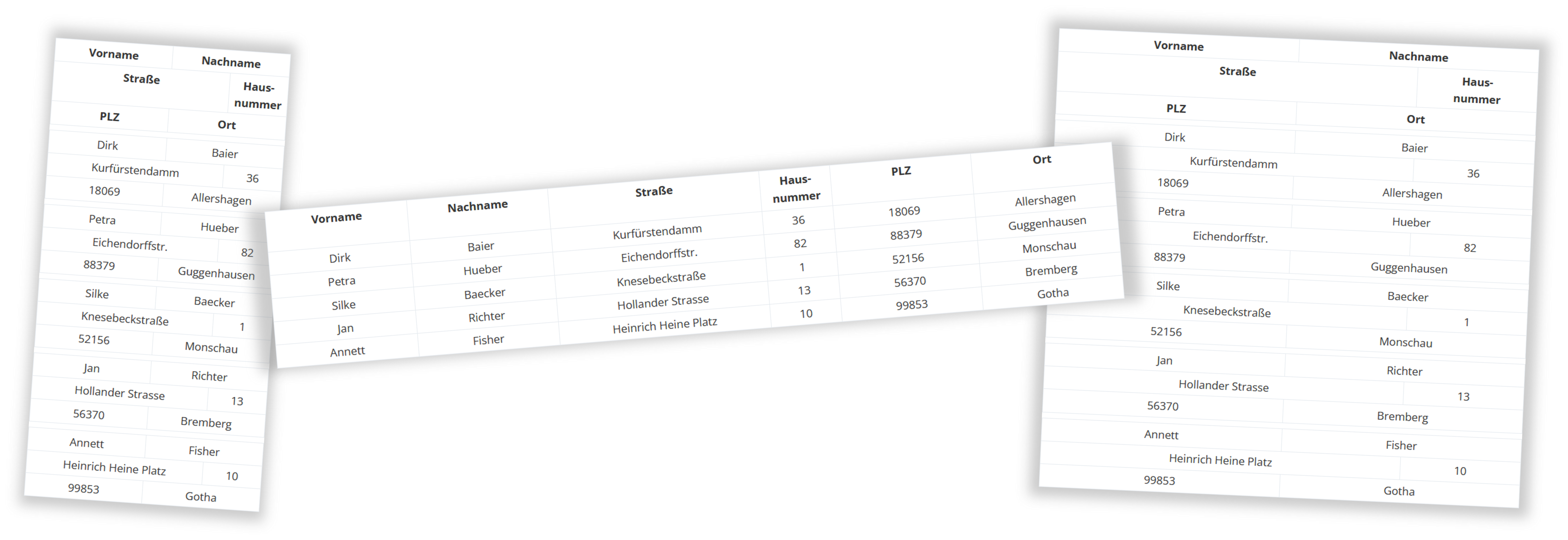
Responsive table with Bootstrap Grid
Like many of you, I’ve also faced the problem of having an HTML table that I wanted to display cleanly on mobile devices without any horizontal scrolling. This is difficult because most tables are designed for width. If you have a table with five or six columns that also need to display content, things can quickly become complicated. Bootstrap Grid instead of HTML Table Then I had the idea to represent the whole thing not with a table, but with a Bootstrap grid. The grid, which consists of twelve grid sections (columns), is perfectly suited to replicating a table. The…
Like many of you, I’ve also faced the problem of having an HTML table that I wanted to display cleanly on mobile devices without any horizontal scrolling. This is difficult because most tables are designed for width. If you have a table with five or six columns that also need to display content, things can quickly become complicated. Bootstrap Grid instead of HTML Table Then I had the idea to represent the whole thing not with a table, but with a Bootstrap grid. The grid, which consists of twelve grid sections (columns), is perfectly suited to replicating a table. The…