Like many of you, I’ve also faced the problem of having an HTML table that I wanted to display cleanly on mobile devices without any horizontal scrolling. This is difficult because most tables are designed for width. If you have a table with five or six columns that also need to display content, things can quickly become complicated.
Bootstrap Grid instead of HTML Table
Then I had the idea to represent the whole thing not with a table, but with a Bootstrap grid. The grid, which consists of twelve grid sections (columns), is perfectly suited to replicating a table. The advantage here is that the grid automatically reflows depending on the resolution of the device on which it is displayed. The goal is to stack the cells in a row if the screen becomes too narrow. This way, a single row is displayed across two or three rows.
As an example, let’s take a table that displays names and address data. We therefore have six columns:
- First name
- Last name
- Street
- House number
- Postal code
- City
With a 12-unit grid, this results in six evenly spaced columns, each with a 2-unit grid width. However, I would only use a single grid width for the house number and widen the street to a 3-unit grid width.
Excursion Bootstrap Grid
The Bootstrap grid is based on twelve columns. By entering a CSS class within an HTML block element, such as a <div></div> or a <section></section>, you can specify how many columns the element should span. For example, the class col-4 makes the element span four columns of the 12-column grid.
You can find a detailed explanation here:
https://getbootstrap.com/docs/5.2/layout/grid/
This is an example of a Grid of twelve col-1 elements:
Or a Grid of four col-3 elements:
Or a mixed Grid:
The Table
We would then create our table as follows:
<div class="container-fluid">
	<div class="row">
		<div class="col-2 p-1 border text-center fw-bold">First name</div>
		<div class="col-2 p-1 border text-center fw-bold">Last name</div>
		<div class="col-3 p-1 border text-center fw-bold">Street</div>
		<div class="col-1 p-1 border text-center fw-bold">House-<br>number<div>
		<div class="col-2 p-1 border text-center fw-bold">Postal code</div>
		<div class="col-2 p-1 border text-center fw-bold">City</div>
	</div>
	<div class="row">
		<div class="col-2 p-1 border text-center">Dirk</div>
		<div class="col-2 p-1 border text-center">Baier</div>
		<div class="col-3 p-1 border text-center">Kurfürstendamm</div>
		<div class="col-1 p-1 border text-center">36</div>
		<div class="col-2 p-1 border text-center">18069</div>
		<div class="col-2 p-1 border text-center">Allershagen</div>
	</div>
	<div class="row">
		<div class="col-2 p-1 border text-center">Petra</div>
		<div class="col-2 p-1 border text-center">Hueber</div>
		<div class="col-3 p-1 border text-center">Eichendorffstr.</div>
		<div class="col-1 p-1 border text-center">82</div>
		<div class="col-2 p-1 border text-center">88379</div>
		<div class="col-2 p-1 border text-center">Guggenhausen</div>
	</div>
	<div class="row">
		<div class="col-2 p-1 border text-center">Silke</div>
		<div class="col-2 p-1 border text-center">Baecker</div>
		<div class="col-3 p-1 border text-center">Knesebeckstraße</div>
		<div class="col-1 p-1 border text-center">1</div>
		<div class="col-2 p-1 border text-center">52156</div>
		<div class="col-2 p-1 border text-center">Monschau</div>
	</div>
	<div class="row">
		<div class="col-2 p-1 border text-center">Jan</div>
		<div class="col-2 p-1 border text-center">Richter</div>
		<div class="col-3 p-1 border text-center">Hollander Strasse</div>
		<div class="col-1 p-1 border text-center">13</div>
		<div class="col-2 p-1 border text-center">56370</div>
		<div class="col-2 p-1 border text-center">Bremberg</div>
	</div>
	<div class="row">
		<div class="col-2 p-1 border text-center">Annett</div>
		<div class="col-2 p-1 border text-center">Fisher</div>
		<div class="col-3 p-1 border text-center">Heinrich Heine Platz</div>
		<div class="col-1 p-1 border text-center">10</div>
		<div class="col-2 p-1 border text-center">99853</div>
		<div class="col-2 p-1 border text-center">Gotha</div>
	</div>
</div>
And this would be the result:
number
To see this for yourself, you can activate mobile device emulation in your browser’s developer options, usually accessible by pressing F12. This can also often be accessed directly via Ctrl + shift + M.
As you can see, the house number column becomes quite cramped on devices with a width of 768px. Bootstrap offers a suitable solution for this. Using various classes, you can configure how much of the 12-column grid should be occupied at different display sizes. The mobile-first approach should be considered here. So, I’ll start with the smallest display size and define how many grid cells each column should occupy. For example, a col-6 class specifies that a column spans six grid cells, or half the screen. This applies to screens smaller than 576px. When the element is displayed on larger screens, it remains at six grid cells. However, if a col-md-3 class is also defined within the same element, the element switches to three grid cells when the screen size exceeds 768px. We can therefore make the cells larger for small screens and stack them accordingly. In this specific case, I would then opt for a three-row layout on small screens.
Here is the code:
<div class="container-fluid">
	<div class="row my-2">
		<div class="col-6 p-1 border text-center fw-bold">First name</div>
		<div class="col-6 p-1 border text-center fw-bold">Last name</div>
		<div class="col-9 p-1 border text-center fw-bold">Street</div>
		<div class="col-3 p-1 border text-center fw-bold">House-<br>number</div>
		<div class="col-6 p-1 border text-center fw-bold">Postal code</div>
		<div class="col-6 p-1 border text-center fw-bold">City</div>
	</div>
	<div class="row my-2">
		<div class="col-6 p-1 border text-center">Dirk</div>
		<div class="col-6 p-1 border text-center">Baier</div>
		<div class="col-9 p-1 border text-center">Kurfürstendamm</div>
		<div class="col-3 p-1 border text-center">36</div>
		<div class="col-6 p-1 border text-center">18069</div>
		<div class="col-6 p-1 border text-center">Allershagen</div>
	</div>
	<div class="row my-2">
		<div class="col-6 p-1 border text-center">Petra</div>
		<div class="col-6 p-1 border text-center">Hueber</div>
		<div class="col-9 p-1 border text-center">Eichendorffstr.</div>
		<div class="col-3 p-1 border text-center">82</div>
		<div class="col-6 p-1 border text-center">88379</div>
		<div class="col-6 p-1 border text-center">Guggenhausen</div>
	</div>
	<div class="row my-2">
		<div class="col-6 p-1 border text-center">Silke</div>
		<div class="col-6 p-1 border text-center">Baecker</div>
		<div class="col-9 p-1 border text-center">Knesebeckstraße</div>
		<div class="col-3 p-1 border text-center">1</div>
		<div class="col-6 p-1 border text-center">52156</div>
		<div class="col-6 p-1 border text-center">Monschau</div>
	</div>
	<div class="row my-2">
		<div class="col-6 p-1 border text-center">Jan</div>
		<div class="col-6 p-1 border text-center">Richter</div>
		<div class="col-9 p-1 border text-center">Hollander Strasse</div>
		<div class="col-3 p-1 border text-center">13</div>
		<div class="col-6 p-1 border text-center">56370</div>
		<div class="col-6 p-1 border text-center">Bremberg</div>
	</div>
	<div class="row my-2">
		<div class="col-6 p-1 border text-center">Annett</div>
		<div class="col-6 p-1 border text-center">Fisher</div>
		<div class="col-9 p-1 border text-center">Heinrich Heine Platz</div>
		<div class="col-3 p-1 border text-center">10</div>
		<div class="col-6 p-1 border text-center">99853</div>
		<div class="col-6 p-1 border text-center">Gotha</div>
	</div>
</div>
And this is what it looks like:
number
To improve readability, I’ve added a margin of my-2 between the table rows. my represents the margin on the Y-axis, i.e., vertically.
If you now look at the result on a smartphone screen, you’ll see that the layout works well. By stacking each table row across three rows, we avoid content spillage and don’t need to scroll horizontally.
To display the table correctly on larger screens, I’m now adding the appropriate classes. I’m using the col-lg-* classes. This causes the grid to wrap at resolutions of 992px and above. This way, on tablets, I still have the stacked view with the normal table view displayed on top.
Here’s the code:
<div class="container-fluid">
<div class="row my-2 my-lg-0">
<div class="col-6 col-lg-2 p-1 border text-center fw-bold">First name</div>
<div class="col-6 col-lg-2 p-1 border text-center fw-bold">Last name</div>
<div class="col-9 col-lg-3 p-1 border text-center fw-bold">Street</div>
<div class="col-3 col-lg-1 p-1 border text-center fw-bold">House-<br>number</div>
<div class="col-6 col-lg-2 p-1 border text-center fw-bold">Postal code</div>
<div class="col-6 col-lg-2 p-1 border text-center fw-bold">City</div>
</div>
<div class="row my-2 my-lg-0">
<div class="col-6 col-lg-2 p-1 border text-center">Dirk</div>
<div class="col-6 col-lg-2 p-1 border text-center">Baier</div>
<div class="col-9 col-lg-3 p-1 border text-center ">Kurfürstendamm</div>
<div class="col-3 col-lg-1 p-1 border text-center">36</div>
<div class="col-6 col-lg-2 p-1 border text-center">18069</div>
<div class="col-6 col-lg-2 p-1 border text-center">Allershagen</div>
</div>
<div class="row my-2 my-lg-0">
<div class="col-6 col-lg-2 p-1 border text-center">Petra</div>
<div class="col-6 col-lg-2 p-1 border text-center">Hueber</div>
<div class="col-9 col-lg-3 p-1 border text-center">Eichendorffstr.</div>
<div class="col-3 col-lg-1 p-1 border text-center">82</div>
<div class="col-6 col-lg-2 p-1 border text-center">88379</div>
<div class="col-6 col-lg-2 p-1 border text-center">Guggenhausen</div>
</div>
<div class="row my-2 my-lg-0">
<div class="col-6 col-lg-2 p-1 border text-center">Silke</div>
<div class="col-6 col-lg-2 p-1 border text-center">Baecker</div>
<div class="col-9 col-lg-3 p-1 border text-center">Knesebeckstraße</div>
<div class="col-3 col-lg-1 p-1 border text-center">1</div>
<div class="col-6 col-lg-2 p-1 border text-center">52156</div>
<div class="col-6 col-lg-2 p-1 border text-center">Monschau</div>
</div>
<div class="row my-2 my-lg-0">
<div class="col-6 col-lg-2 p-1 border text-center">Jan</div>
<div class="col-6 col-lg-2 p-1 border text-center">Richter</div>
<div class="col-9 col-lg-3 p-1 border text-center">Hollander Strasse</div>
<div class="col-3 col-lg-1 p-1 border text-center">13</div>
<div class="col-6 col-lg-2 p-1 border text-center">56370</div>
<div class="col-6 col-lg-2 p-1 border text-center">Bremberg</div>
</div>
<div class="row my-2 my-lg-0">
<div class="col-6 col-lg-2 p-1 border text-center">Annett</div>
<div class="col-6 col-lg-2 p-1 border text-center">Fisher</div>
<div class="col-9 col-lg-3 p-1 border text-center">Heinrich Heine Platz</div>
<div class="col-3 col-lg-1 p-1 border text-center">10</div>
<div class="col-6 col-lg-2 p-1 border text-center">99853</div>
<div class="col-6 col-lg-2 p-1 border text-center">Gotha</div>
</div>
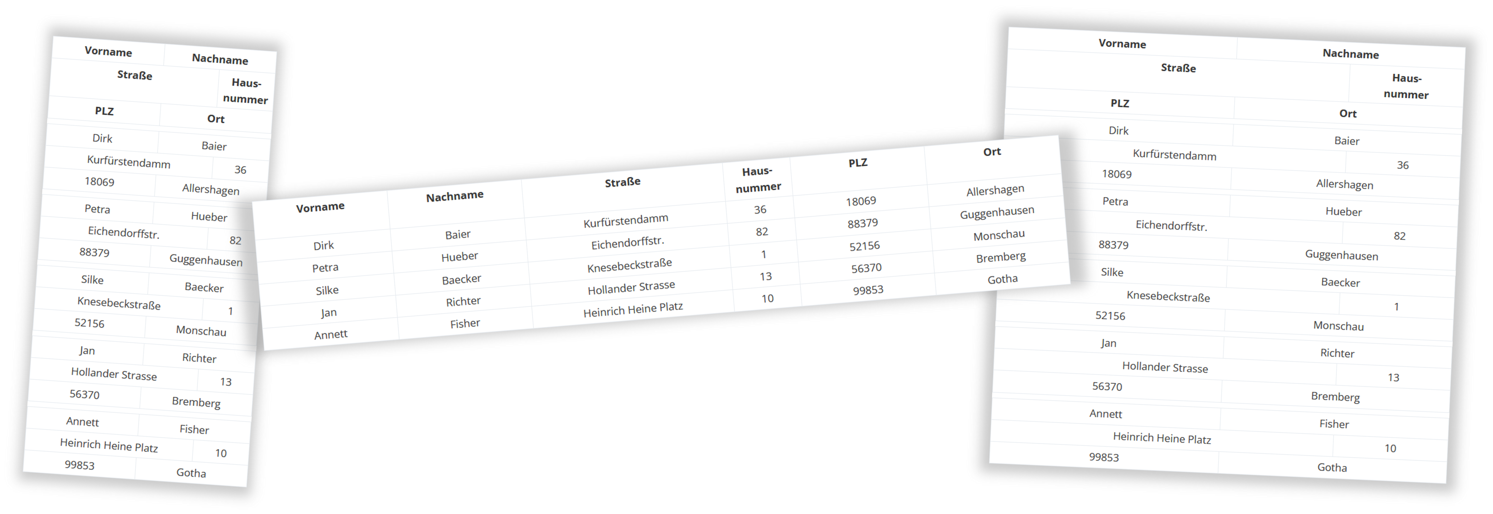
</div>And this is what it looks like:
number
Adding the class my-lg-0 to the div.row removes the spacing between the rows at higher resolutions. As explained above, the combination col-6 and col-lg-2results in 6 grid cells being used for the column on small screens, and only 2 grid cells being used when displayed on screens ≥992px. Thus, the stacked row of 3 cells becomes a normal row.
The border
If the borders bother you, you’ll unfortunately have to use CSS to fix them. Remove the border class everywhere and create the borders using a CSS media query for the screen sizes in use. In our example, that would be max-width:991px and min-width:992px.
The code for the last table would then be as follows.
CSS:
@media (max-width:991px) {
	.row-border {
		border-top:var(--bs-border-width) var(--bs-border-style) var(--bs-border-color);
		border-left:var(--bs-border-width) var(--bs-border-style) var(--bs-border-color);
	}
	.col-border {
		border-bottom:var(--bs-border-width) var(--bs-border-style) var(--bs-border-color);
		border-right:var(--bs-border-width) var(--bs-border-style) var(--bs-border-color);
	}
}
@media (min-width:992px) {
	.container-border {
		border-top:var(--bs-border-width) var(--bs-border-style) var(--bs-border-color);
		border-left:var(--bs-border-width) var(--bs-border-style) var(--bs-border-color);
	}
	.row-border {
		border-bottom:var(--bs-border-width) var(--bs-border-style) var(--bs-border-color);
	}
	.col-border {
		border-right:var(--bs-border-width) var(--bs-border-style) var(--bs-border-color);
	}
}
HTML:
<div class="container-fluid container-border">
	<div class="row row-border my-2 my-lg-0">
		<div class="col-border col-6 col-lg-2 p-1 text-center fw-bold">First name</div>
		<div class="col-border col-6 col-lg-2 p-1 text-center fw-bold">Last name</div>
		<div class="col-border col-9 col-lg-3 p-1 text-center fw-bold">Street</div>
		<div class="col-border col-3 col-lg-1 p-1 text-center fw-bold">House-<br>number</div>
		<div class="col-border col-6 col-lg-2 p-1 text-center fw-bold">Postal code</div>
		<div class="col-border col-6 col-lg-2 p-1 text-center fw-bold">City</div>
	</div>
	<div class="row row-border my-2 my-lg-0">
		<div class="col-border col-6 col-lg-2 p-1 text-center">Dirk</div>
		<div class="col-border col-6 col-lg-2 p-1 text-center">Baier</div>
		<div class="col-border col-9 col-lg-3 p-1 text-center ">Kurfürstendamm</div>
		<div class="col-border col-3 col-lg-1 p-1 text-center">36</div>
		<div class="col-border col-6 col-lg-2 p-1 text-center">18069</div>
		<div class="col-border col-6 col-lg-2 p-1 text-center">Allershagen</div>
	</div>
	<div class="row row-border my-2 my-lg-0">
		<div class="col-border col-6 col-lg-2 p-1 text-center">Petra</div>
		<div class="col-border col-6 col-lg-2 p-1 text-center">Hueber</div>
		<div class="col-border col-9 col-lg-3 p-1 text-center">Eichendorffstr.</div>
		<div class="col-border col-3 col-lg-1 p-1 text-center">82</div>
		<div class="col-border col-6 col-lg-2 p-1 text-center">88379</div>
		<div class="col-border col-6 col-lg-2 p-1 text-center">Guggenhausen</div>
	</div>
	<div class="row row-border my-2 my-lg-0">
		<div class="col-border col-6 col-lg-2 p-1 text-center">Silke</div>
		<div class="col-border col-6 col-lg-2 p-1 text-center">Baecker</div>
		<div class="col-border col-9 col-lg-3 p-1 text-center">Knesebeckstraße</div>
		<div class="col-border col-3 col-lg-1 p-1 text-center">1</div>
		<div class="col-border col-6 col-lg-2 p-1 text-center">52156</div>
		<div class="col-border col-6 col-lg-2 p-1 text-center">Monschau</div>
	</div>
	<div class="row row-border my-2 my-lg-0">
		<div class="col-border col-6 col-lg-2 p-1 text-center">Jan</div>
		<div class="col-border col-6 col-lg-2 p-1 text-center">Richter</div>
		<div class="col-border col-9 col-lg-3 p-1 text-center">Hollander Strasse</div>
		<div class="col-border col-3 col-lg-1 p-1 text-center">13</div>
		<div class="col-border col-6 col-lg-2 p-1 text-center">56370</div>
		<div class="col-border col-6 col-lg-2 p-1 text-center">Bremberg</div>
	</div>
	<div class="row row-border my-2 my-lg-0">
		<div class="col-border col-6 col-lg-2 p-1 text-center">Annett</div>
		<div class="col-border col-6 col-lg-2 p-1 text-center">Fisher</div>
		<div class="col-border col-9 col-lg-3 p-1 text-center">Heinrich Heine Platz</div>
		<div class="col-border col-3 col-lg-1 p-1 text-center">10</div>
		<div class="col-border col-6 col-lg-2 p-1 text-center">99853</div>
		<div class="col-border col-6 col-lg-2 p-1 text-center">Gotha</div>
	</div>
</div>
And this is what it looks like:
number
I’ve added a *-border class to each <div></div> element to address it separately from other elements. The simple CSS code can be found in the <style></style> block above. I’ve used Bootstrap variables for border thickness, color, and style, the same ones that would be used when using the Bootstrap border class. Of course, you can customize these properties yourself if you prefer.
Even more display sizes
This whole system can be expanded to accommodate even more screen sizes, especially with more columns. If I have a table with eight or nine columns, I can stack it across five rows on the smallest screen size (<576px). On screens ≥576px, I stack it across four rows. At ≥768px, I reduce it to three rows, and so on. This allows me to redesign the table for each screen size. I can even adjust the cell order using the order-* classes. For example, I could ensure that first and last names are displayed last on a smartphone. To do this, I would simply assign the classes order-2 order-lg-1 to the div.col-* columns for first and last names, and order-1 order-lg-2 to the other div.col-* columns. This will result in the cells being swapped in order on small screens and being correctly re-ordered on screens ≥992px.
I hope this has helped you create beautiful and responsive tables. Feel free to leave feedback in the comments.
Leave a Reply
You must be logged in to post a comment.